

Improving the design for lezzet shawarma with difficult navigation and bad user experience
Role: UX designer responsible for user research, ideation
and overseeing design implementation
Team Interactions: Collaborated with three UX designers.
Project Duration: 6 weeks
Problem Statement
Lezzet Shawarma and Falafel is a well known Shawarma place in Canada. As a team, we felt the website had a poor user interface. There was a vertical navigation that was causing disruptions with lack of user control and the landing page of the website had unclear and inconspicuous CTA buttons ("menu" and "location"). We agreed that it lacked consistency and an appealing brand identity. The use of low-contrasting and low-quality visuals was disturbing for us as end users.
Objective
Redesign the website to improve the overall user experience, establish a strong brand identity, and provide users with easy access to essential information, such as the menu, location, and contact details.
User flow


Usability testing
We carried out four usability tests to gain valuable insights into their perceptions and interactions with our responsive website.
Findings -
-
This menu lacks visual aids and relies heavily on detailed descriptions, leading the customer to prefer not to complete their process
-
The absence of pictures of the shawarmas and falafel makes it difficult for the customer to assess their appearance and quality, potentially impacting their decision to visit the establishment.
-
The user suggests that the menu could have been better organized with clear categorization for ease of navigation and selection.
-
The user finds the homepage overly cluttered and confusing, criticizing the use of bright colors and the presence of numerous disparate elements.
-
The customer suggests that the website could have improved its appeal by including high-quality pictures.
Low-fid wireframe
Mobile


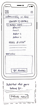

1. The Primary Navigation containing the logo on the left
2. The primary Navigation contains the hamburger menu on the right. The Hamburger menu includes Menu, Location and Contact, Catering, about Us, Reviews and Home
3. The main CTA of Menu and Location as the restaurant doesn't offer delivery and is purely to look for menu and location.
4. The footer with all the necessary information
5. Categorization of food tabs
6. A nice and wonderful picture
7. Video showing one of the catering services done by the restaurant.
8. Reviews/Testimonials in an auto-scrollable fashion.
Desktop


Mid fidelity wireframes
After a comprehensive discussion regarding the paper wireframes, we developed mid-fidelity wireframes. As previously outlined, we incorporated prominent Call-to-Action (CTA) buttons for the menu and location, recognizing that these are the primary objectives for users visiting the website. Given the responsive nature of the site, we ensured that essential information is readily available on the homepage.
Mobile
Home

Menu

Catering

About

Reviews

Location

Desktop
Home

Menu

About

Catering

Reviews

Location

Usability Testing of Mid-fi Wireframes.
We carried out four usability tests involving four participants to gain a deeper understanding of user interactions with the mid-fidelity prototypes. Insights gathered from their experiences highlighted specific aspects to be incorporated into the final prototypes.

"Oooh. I think the Veg non-veg indication is missing"

"How do i know the spice level of each item? I mean i have seen it being used in other food apps and websites"

"If the ingredients were mentioned i would have had a basic idea on what to choose and what not to choose as i am allergic to few"

"Please add tempting pictures. That does make a difference"